

Sorry but any article about what internet users are saying about any topic is not real news. It’s not even noteworthy.
Apple: adds blur effects, rounded elements, and color themeing
Homo Sapians: “Wow, another groundbreaking idea from Apple!”
It’s not just blur though, it actually refracts what’s behind the element, which sounds more performance intensive than it needs to be, and sometimes it’s heavily distracting, but let’s not kid ourselves that this is just windows vista on a Mac, they’re emulating more of the physicalities of glass than just a static shine
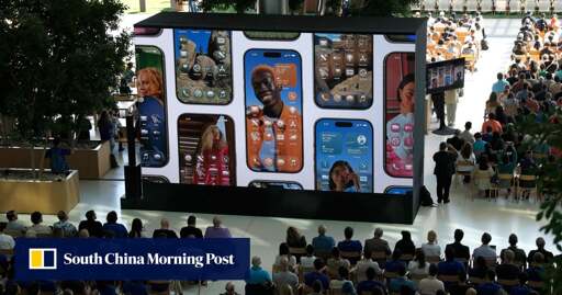
The platform saw more than 20,000 mainland netizens express their discontent over the new design.
Halt everything!! 20k people saying things on the internet!!
And most other consumers, I would wager.
If this were an optional “skin” of sorts, it would have been completely fine with me. But this is a forced redesign, and a really bad one at that. There will likely be changes before the GM release comes out, but overall I just don’t like the design direction, nor the performance implications
I guess I’m from China then
Sorry, I really don‘t mean to be rude or hurtful, but from all I‘ve seen and I mean ALL I‘ve seen Chinese consumers have no taste whatsoever. Yes, their manufacturing has become great if they actually care about something but this argument is not about stability. What I mean is the more a company relies on the Chinese market and tailors their commodities abd luxury products around Chinese consumers, the uglier they become. Just look at European cars lately. Hideous. So yeah sorry again but I take that as a seal of quality for Apple‘s UI design.
